Branding for a board game company
Whisk yourself back to a time when gradients were daring and mono weight icons were all the rage. CMON came to me for a rebrand and had had two requirements. One was YELLOW + PURPLE and the other was that the logo would be designed by committee... I take zero responsibility for the logo 🤢
Since the color requirements were already so funky, I really tried to push for a more abstracted and modern position for the brand. This helped CMON establish itself as something new and different compared to how stuffy and old school most board game companies present themselves.

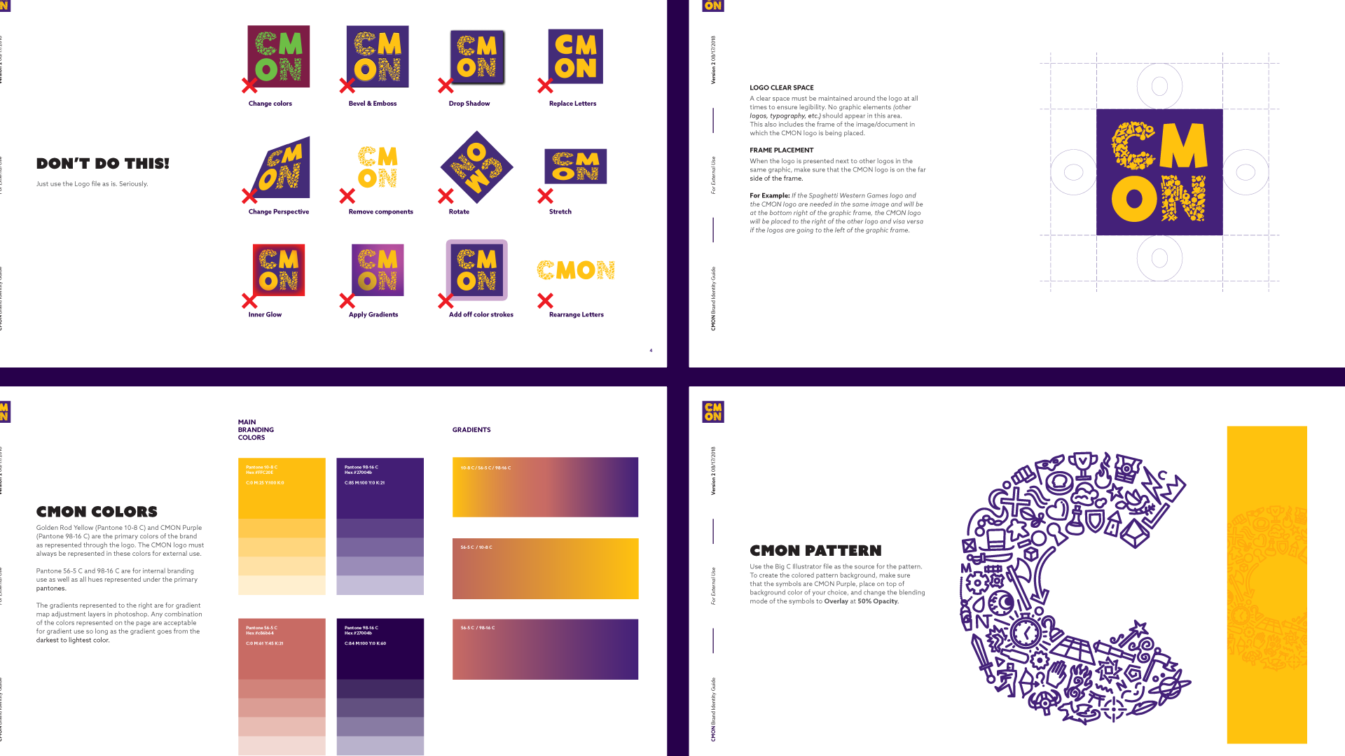
I created the collage of symbols (all of which are from various CMON games) as the primary branding element to represent just how diverse the product range is. I tried to create a visual language that would help bridge the various styles in the game catalog while also remaining recognizable on its own.

I then tried to reign this brand in with a clear and concise set of guidelines.

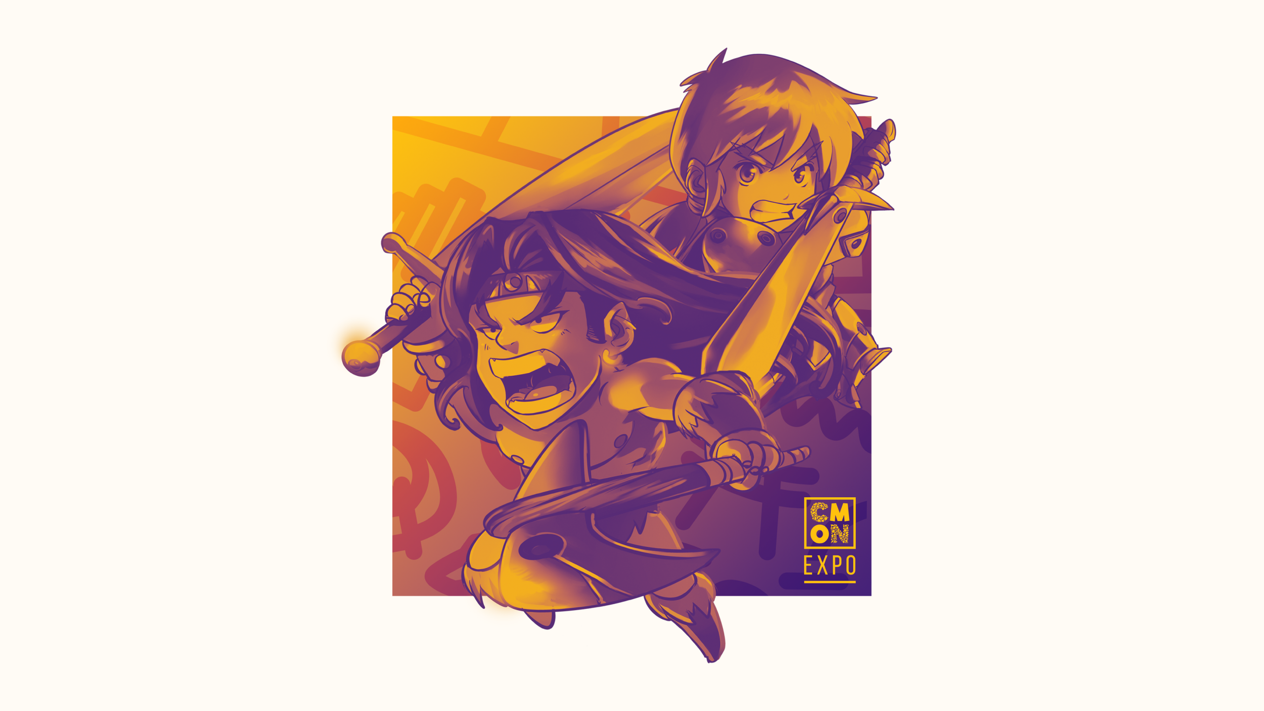
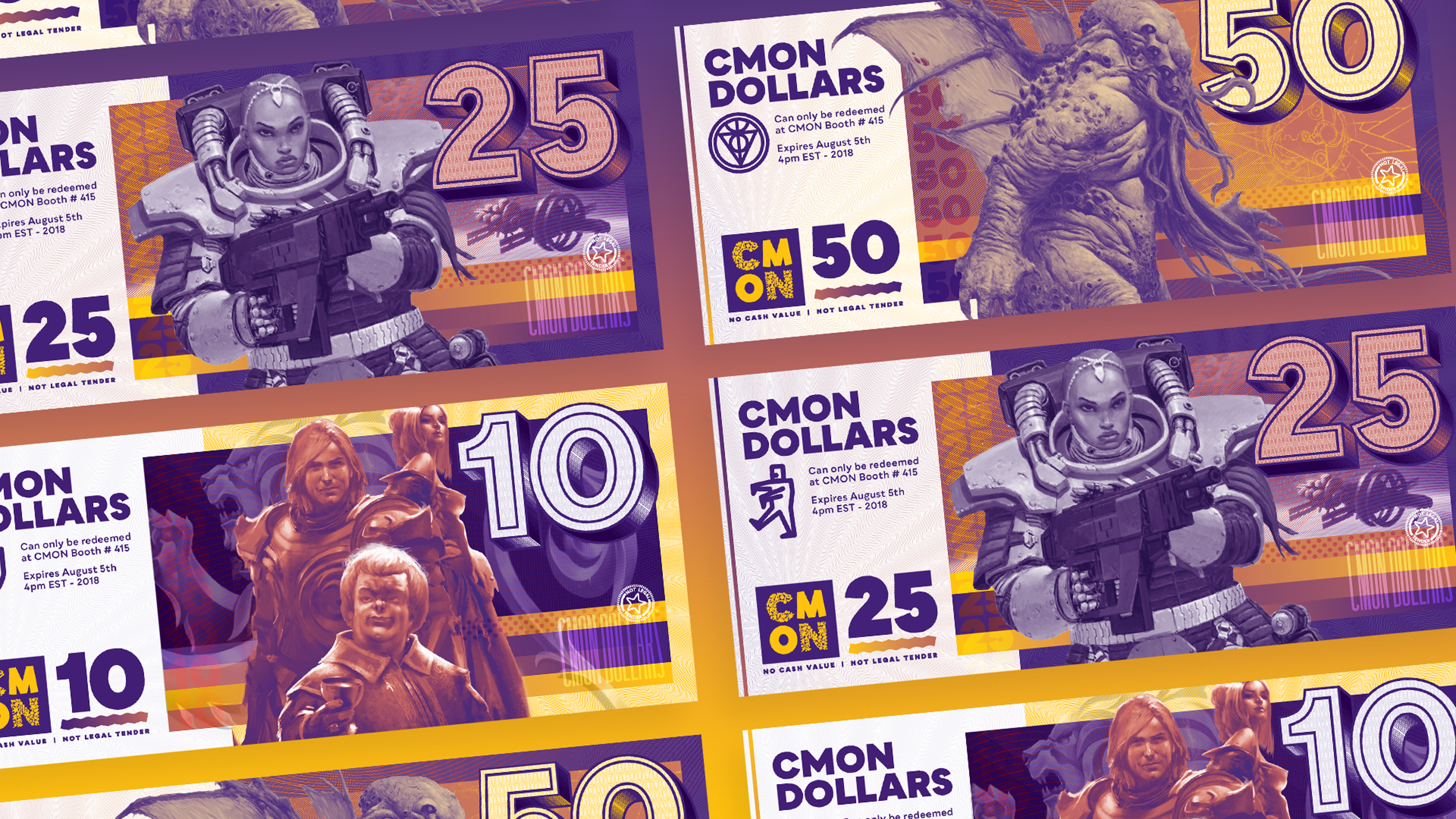
One of the main design motifs I made for the brand was gradient mapping the key art of different games. This helped bring a bunch of very different art styles under one clear brand element.

Some gradient mapping in action. Not legal tender.


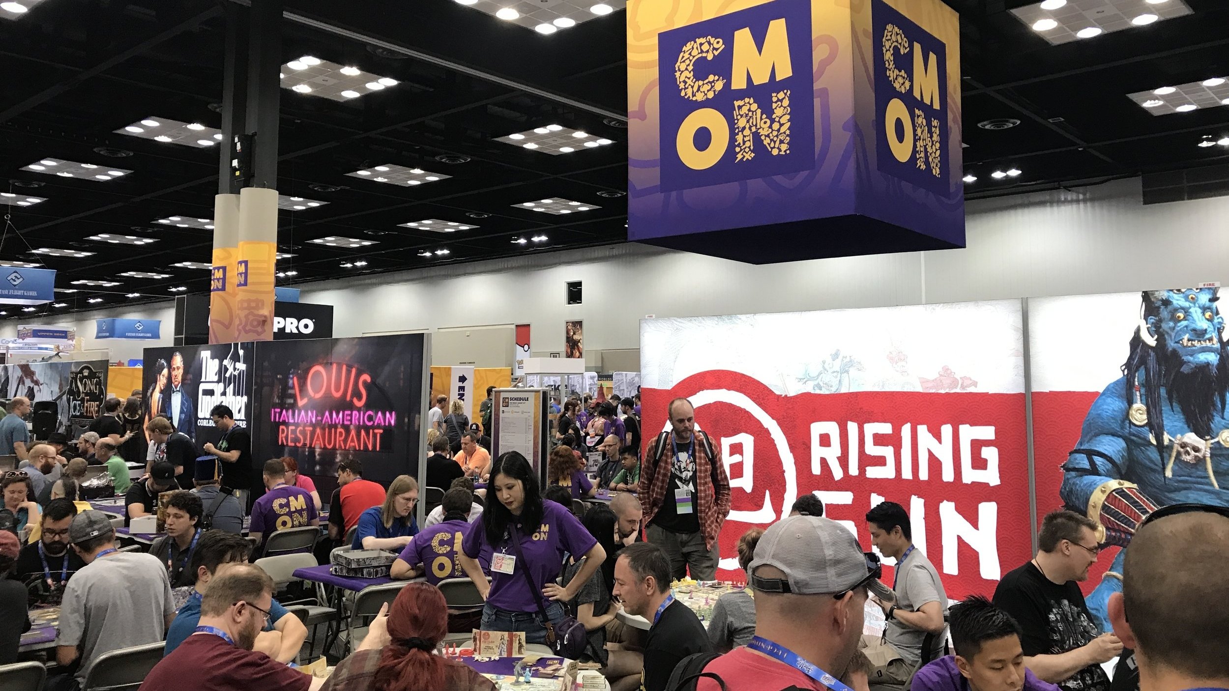
Here's some pics from GenCon. Not only did I design that CMON Doom Cube™, but I also designed a ton of panels for the featured games (including that fake neon sign from scratch).

